Free background from VintageMadeForYou

10 March 2013

Friendship album side 1

This album is being made for a friend of mine. I am again using it as a motivational piece, with some great sentiments.

This is another of my great $.50 album purchases, only this one was purchased near Christmastime and I never had time to do anything with it.  It was a Christmas Tree Ball album, but I have converted it into a circle album.


I usually adhere my paper to chipboard albums using mod podge. I coat the chipboard and the paper then place them together, I use a brayer to remove bubbles and make it flat.


Here is what one side looks like all papered up and ready for decorating.  The bottom photos are stage one of decorating.
There is more to come.


I used some Stampin UP!  butterfly stamps and kindness matters stamp, some stamps (frame) I forgot who made. I think Spellbinders, some of the paper that came with the Rob and Bob paper pack, an owl stamp that was $1 at Michael's, the inks are StazOn and Tim Holtz, t


A serious case of creative block pt 1

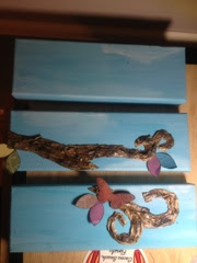
I purchased these wonderfully made canvases a few weeks ago. My intention was to make the most stunning three panel painting you had ever seen.  I started it and BLAH! I hated it!  So, I set the whole project aside until I thought what I could do to save these normally expensive canvases.

Today I pulled out the gesso and went to work.  I decided to mix the gesso with three different blues.  I really liked this....I got an idea!!!

Once the canvases dried, I took one of my favorite books and ripped out about 10 pages. Don't panic, it is from the 1980's...it is old smelling and frankly falling apart because SOMEONE has read it way too much.  I bought another copy about a year ago (an even older copy) and I use this one for my art.  The book?  Why "Song of the Siren" by Philippa Carr.  Carlotta Main is a fascinating character.

Anyhoo, with these book pages I made a pattern of a tree that I wanted. Really it didn't start out as a pattern it was going to be the actual tree, but I needed MORE!!!  So it became a pattern.  I then cut the tree from a piece of chipboard.  Completely coated it with mod podge and decoupaged some pieces from the book onto the chipboard.  I still wanted more. I wadded up more book pages, straightened them out and inked them to death.  Many different colors of brown inks.  Sprayed with some Michelle's Musings brown and silver sprays.  Once that dried, I wadded them up and inked again.  These steps seemed to take FOREVER, but the longest step was yet to come.

Once everything dried I tore large rectangles from the pages.  I put on a thick layer of mod podge on the tree and then some on the rectangle.  I could not take a photo of this because it is incredibly messy!  I bunched the rectangle up onto the tree to resemble bark. I had to keep a paint brush with mod podge handy to put in between the bunched up part to keep it looking like bark.  This step took HOURS!!!  It was messy, it was hard to maneuver a 30 year old book page that is fragile to begin with, but I went and made it more so. I ripped many and had to use another section.  I did not want it in pieces I wanted large rectangle so it would be more like bark. 

Once this step was dry, I inked more.  Good gravy I was a mess!!!  My apron was a mess where I had wiped my hands and my craft sheet looked like a ink/mod podge bomb had gone off....but I kept going.  I spritzed this inking with water...then with some sparkle spray.  Let it dry.

I fashioned the tree across the canvas and then I cut it to fit across the canvases.


The last photo shows my plan for the layout, but I am going to be honest, the finished product may not look like that. I won't be able to work on it until next weekend, and I may change my mind. Or I might just start all over again.  Stay tuned for part 2. 


03 March 2013

Sunday afternoon good times


This is the album I made today. It is the second chipboard album that I made yesterday.  The Marilyn page is my favorite. The image on the far right is a stencil that I had cut, the other three Marilyn faces are transparencies that I made.  I printed Marilyn faces using my Marilyn dingbat font.  I took packing tape and adhered to the front of the faces.  I pressed it down and even rolled the brayer over each image.  Then I ran warm water along the back and rubbed off the paper.  I LOVE the way they turned out.  This page will actually be added to the album I made yesterday. 


This second album was made for a friend that just recently had to put her dog to sleep.  She is heartbroken and I thought it might help to have a place to reflect on her beloved dog and maybe relive a memory or two.


24 February 2013

Trace Creek Crop Completed Projects

One of my favorite days of the year is the Trace Creek Crop.  Yesterday was a day that my friends and I look forward to for months and months.  We got signed up in December and then you impatiently wait until it's here.

I didn't have extremely lofty scrapbooking goals yesterday. I am still until that stupid weight restriction and I wasn't sure I would be able to sit all day. In all actuality I found that I could sit for a while, get up and shop or just walk around and talk and I was fine.

I accomplished 3 scrapbook pages (I am almost finished with the October cruise, then onto the Christmas Harry Potter).  I made one cigar box (which I plan on doing a tutorial to very soon), and 16 cards.


Most of the cards that I made were completed using the Lucille paper pack.  I found this in October at Archivers and it has been a constant favorite since then.  It is reminiscent of the old fashioned clothing patterns my grandma used and the floral papers are very much like the patterns of dress that I wore in the 1970's.  I spent $12 at one of the booths yesterday to get some Lucille chipboard and tags. The other paper that I used was another favorite, Ladies Diary by Graphic 45. 


09 February 2013

The dollar bin birdhouse

I found this cute little birdhouse in the dollar bin at Michael's. I decided it would be good in my laundry room make over so I purchased it. It was a paper mâché finish. The first thing I did was gesso the entire thing so I could paint over t and get true colors to my paint.

I chose the colors that I have been using for my other utility room projects. I thought it might be nice to try an ombré effect since e that was so hip. One thing I dot usually rinse my brush between colors. Actually I hardly ever rinse my brush. You can tell, but I really like the effect.

Once my paint dried, I took some walnut stain distress ink and a new dry brush. I brushed the brush against the stamp pad then dry brushed onto the house. The effect turned out nice.


Newspaper roses

I had read somewhere, probably Pinterest, about a girl that made roses from newspapers. I don't recall ever reading how to make them, but decided that I wanted to make some for this utility room makeover thing I am doing. Actually I am planning on framing them.....after I make the frame that is.

Since I didn't read to tutorial I had to make up my own. I took a newspaper that was still rolled up from the driveway and cut the roll into pieces. Quite like you
would if you were slicing bread. My slices were about 1-1.5 inches thick. After I complete the slices, I unrolled the slices and glued them end to end....making a long strip. It did sort of roll up on itself, but I thought that would be easier to make into a rose. I actually used a glue stick to glue my strips together. Then I started rolling. I would roll a bit and then twist the newspaper to make what would appear to be a petal. I just kept repeating the process. When the flower was as large as I desired I cut the strip and glued it under my flower. Then I started rolling the next flower. I got 5 flowers from one a newspaper.


Once I finished with the last flower I started painting the flowers. I used a pink and a red. I poured both into my palette next to each other. I used mostly pink to paint the flower, then I dipped my brush without cleaning in the red. I brushed it too the flower in other parts. Then I loaded my brush with pink and red and went over it again.

I repeated the process with two shades of blue and the same brush. Therefore I got a tad of purple on these flowers.

I liked the effect hope you do too.


26 January 2013

Finding Your Happy Place

This Saturday started out earlier than I imagined...the cat started meowing at 4:15am.  Does she not realize it is Saturday?  Silly Cat.  I finally gave up all hopes of sleeping around 6:00am and got up.  First things first, I fed the cat...then I sat at my art table.  My brother-in-law had saved me some old photos and I wanted to use some in something today.  I thought I would look at my favorite creative site CR84FN and do the challenge colors.  The owner had made a new post with this challenge's best projects.  They were lovely!!  I read the post, Mona (the owner) was closing the challenge.  WHAT?  No more CR84FN!  I was so sad. I have played along for a couple of years and the challenges have inspired me to try new things, to think outside of the box, and most of all to not be afraid of my least favorite color.....YELLOW!!!!

I picked myself up and decided to think about something happy.  I thought of a friend who has been on my mind a lot lately.  She is going through an extremely tough time, but you would not know it.  She smiles all day, she offers to pray for others, she works hard, but she is hurting.  What is her secret?  I think it's her faith in God.  She has given her problems to God...praying everyday.  She is pretty wonderful.

I decided to paint and I was going to paint what I thought her soul looked like.  A colorful world, with many flowers, lots of things going on, but still she is wearing a pretty dress.  Her castle represents the Kingdom of God.  It's a pretty deep painting for one afternoon.  As you can see from the painting, I think her soul is a pretty happening place. I am grateful to be her friend and grateful to know her.

What started off as a rough day ended up pretty swell.  

Luke 6:31 And as you wish that others would do to you, do so to them.


********************************************************************************
The painting contains many different types of acrylic paint...apple barrel, craftsmart and Americana.  I used stamps from Technique Tuesday.  Inks by Stazon, red flower made by Ina Champion (my mom-in-law) and is about 30 years old, paper flowers in purple made by Michelle's Musings (hey, that's me), green flower by Prima, yellow flower by Creative Memories.  Leaves cut from green cardstock scraps and the die is by Sizzix.  Castle, clouds, bubbles, happy word and all shapes designed and painted by me.

This painting is dedicated to my friend....may she display it proudly.


19 January 2013

CR84FN Challenge 70----Wish my eyes were Aqua

Have you ever seen a person with Aqua eyes?  They are simply breathtaking!  This color makes me wish I was around it all the time. I had thought of doing a room in my house this color, but I am saving it for now.  One day, if I ever get a craft room the walls will be purple and aqua.  So I am saving it.  In the meantime I will stick to putting it into my work.

Three of today's cards feature a line of paper that I have been trying to get my hands on for MONTHS!  Every time I went to Achiever's they were out.  In early December I got to go on a trip for my work and had about two hours to go to the mall.  I only went to Achiever's and there I did some serious damage to my pocketbook.  One of the things that I bought was a 8x8 of Ladies Diary by Graphic 45.  The pad that has eluded me for what seems like FOREVER and now it is MINE!!!!  Here are the first projects I made using a single sheet. *****I intend for this paper to last me quite a while.  

Images of ladies and gentlemen are from the Ladies Diary paper pad.  The patterned paper and the stickers are by Creative Memories, the ink is by Tim Holtz (Distress), the bird and butterfly die cuts are by K&Co and the flower by Prima.  They all go together so nicely. I simply can't stop staring at them.

The last card is just as cute, but playful too.  It features a bike by K&Co.  I have actually had it for some time I just didn't know what to do with it.  I think this works nicely.

******************************************************************************

I am also going to put a little chat in this blog.  Think about Happiness.  What does it mean to you?  I am an extremely happy person. I am blessed beyond measure. I have a wonderful family.  I have a great job.  I thought about why people are NOT happy.  One of the books I read was The Happiness Project and while I KNOW I have flaws, my family has flaws, my life has flaws....I would read this and think "I am way happier than this girl".  So I am just going to share with you something that I read years ago and made note of...

Happiness is an attitude. We either make ourselves miserable, or happy and strong. The amount of work is the same.
-- Francesca Reigler

 You can agree or not, that doesn't matter, what matters is I am happy, I am blessed, I am loved. 


The Third weekend of 2013

I always have a fear of not finishing things. I try hard to achieve the end of the goal. I write down my goals and follow through with completion.  There is something wonderful about adding that check mark on the iPhone or marking a line through the paper notes.  A deep satisfaction.

Proverbs 15:23 - "A man finds joy in giving an apt reply and how good is a timely word!"

One of my goals last year was to send more cards. I did EXCELLENT with that goal last year. I sent more cards than I ever had before even to random folks just so they would know someone cared. I can't tell you how many people would email me back saying that my card arrived when the needed it most.  That God must have knew they needed that encouragement today.  That is how it started...I let God guide me with who needed a card.  Often when I sat down to write out the cards I had NO idea who would be receiving the cards and BAM it just hit me who needed it.

Here is a verse I remember when I am trying to stay on target

2 Timothy 1:7
  For God did not give us a spirit of timidity, but a spirit of power, of love and of self-discipline. 

Self discipline!! I try to use it every day of my life.  If you find it hard  to stay focused, stay on task, to achieve the goal, think about writing down your goals.  Even a simple task of "fold laundry" or "put away computer cords" all the way to "get oil changed" gets completed with a goal sheet.  

If you need help with what type of goal sheet to use, there are some fabulous ones in word, on the internet or if you have an iPhone my new favorite is Wunderlist.  It syncs to my mac and iphone with no issues.  It has a place for lists that include shopping, private, work and  a wish list.    http://www.6wunderkinder.com/wunderlist

 ******************************************************************************
I realized if I am going to keep this goal of sending cards in 2013, I needed to make more...so today that was my focus.  I have missed every CR84FN this year so today was  good time to start back in my routine.  Actually, I did two weeks of challenges even though one had ended.  This is the color palate for the previous week.

I am so in love with the colors.  Raspberry, Lavender and Neutral.  What a perfect combo! I have always wanted a room in the raspberry color....ALWAYS!!

Three of the fours cards used for this scheme have a 1920/1930 vibe.  I have this Graphic 45 paper from the Curtain Calls collection that is simply perfect for someone like I (that is someone going through a 1930 fab).


Picture Perfect....eatures Rudolph Valentino and I am pretty sure, Theda Bara.  If it is not Theda I will be shocked.  It is just hard to tell given the rough drawing.  Both were very famous in their day, Rudy was seen as SEXY and Theda was VAMPY (all be it a bit trashy in my eyes).  This is a simple design using the Graphic 45 tags and Creative Memories paper.  All inks are by Tim Holtz (Distress line). 

The next two use a jazzy font from my MAC (Andes).  I used Jazzing sayings from the Roaring 20's.  Again, I used the Graphic 45 tags, do you see Louis Armstrong?  I also used more of the CM paper and of course the Tim Holtz ink.  The brads are by K&Co from the Mira collection.

The last one is my favorite. I took a die cut from K&Co and inked it using Walnut Stain.  I took the CM paper once again and inked it, then spritzed with water.  I sprayed the butterfly with water and curled the wings and left a hump along the body so it looked three dimensional.  I inked the back of the wings to give some depth.  After she dried I glued her onto the CM paper.  I think poked holes for the antenna and a flying trail.  I used DMC floss to backstitch along the holes.  I absolutely LOVE the way this one looks.